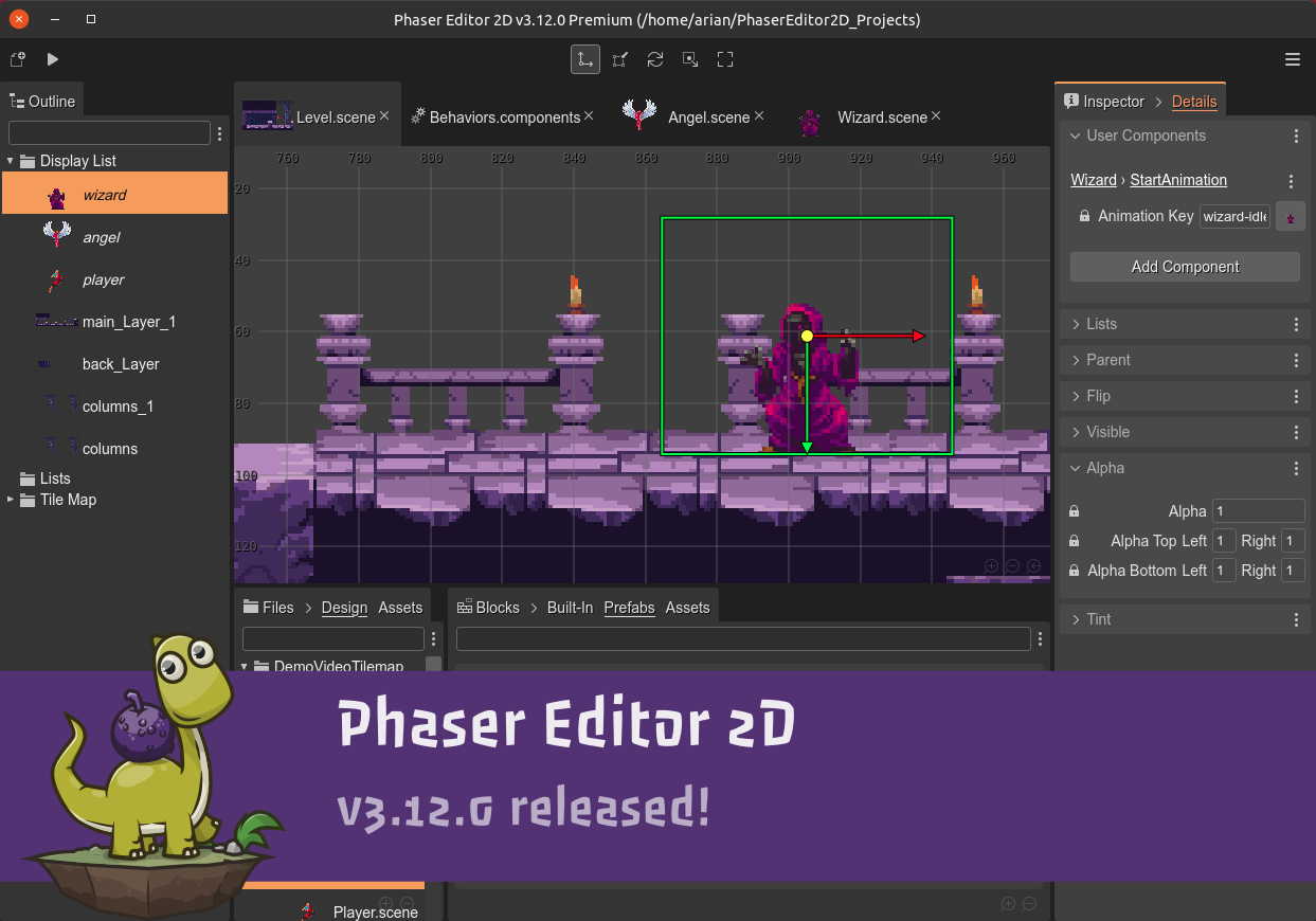
Phaser Editor 2D v3.12.0 released!
March 12, 2021 - Posted in release
Hi!
Yes, the past week I released a version of the editor, and today I’m releasing a new one! The main reason is the Phaser team published v3.53.1 of the framework so, the editor should be in sync with Phaser.
However, a release is always an opportunity for adding some new features. In this delivery, I added some I think you will like: a new icons theme, more options for filtering the Files view, and the Inspector view.
Download Phaser Editor 2D v3.12.0
Games and tutorials
If you are creating games, tutorials, or any other content (no matter if it is your first project) with Phaser Editor 2D, please tell me, and I will be proud to feature it in the website, newsletter, and social channels.
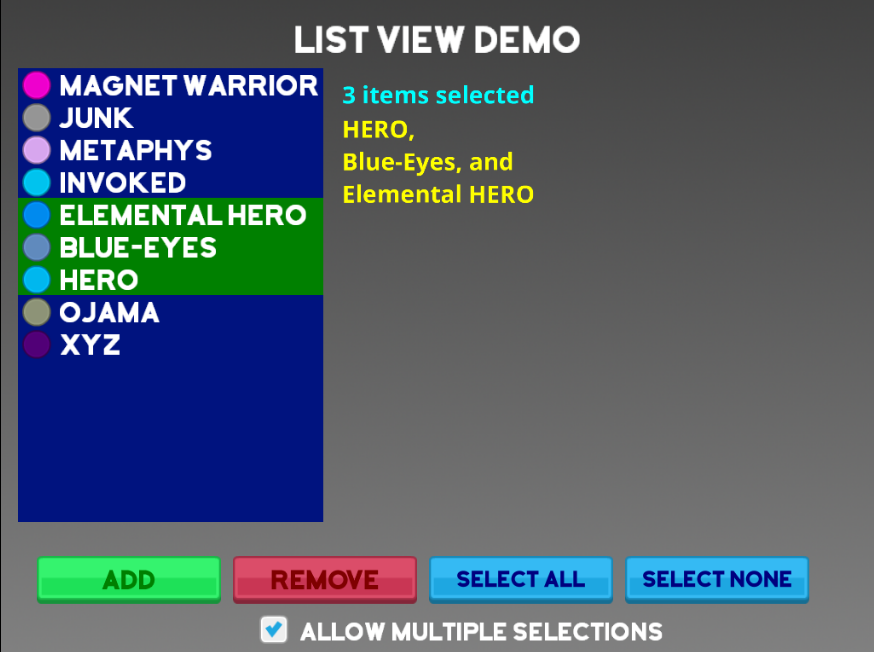
[User Tutorial] How to Create a List View Component in Phaser Editor v3
We have a new article from Cartrell Hampton!
…I realized that in order to create the list of players and games, I’ll need to build a list view. And since I’m using Phaser Editor v3 and its User Components functionality, I decided to build the list view, similar to how I made the button component.
Read the article in GameplayCoder.com
Collaboration
A lot is happening in our Discord server. Join us for collaboration. Ask questions or tell us your ideas. Your feedback is highly appreciated and is very important in the process of providing a more friendly and stable IDE.
Phaser v3.53.1
The Phaser team released v3.53.1 and now Phaser Editor 2D supports it by default. New projects will include this version of Phaser. To update old projects you need to do it manually.
Learn more about Phaser v3.53.1
Details tab of the Inspector view
The Inspector view shows the properties of the objects selected in another view or editor. In the case of the Scene Editor, the Inspector view may show a lot of properties and it could be hard for you to find the right one.
In this release, many of the properties are hidden by default and are shown only if you select the Details tab:
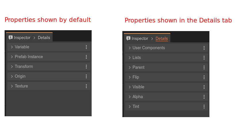
I did a selection for you of what I consider is a “detail” property. But you can change that, and show another property section in the Details tab. Just open the section menu and check the Show In Details option:
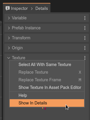
Sure, you can hide a property section from the Details tab by unchecking the same menu option.
The Design and Assets tabs in the Files view
The common activities you do with Phaser Editor 2D are to design scenes and pack assets. However, your project may have a lot of files that are not related to one of these activities, like JavaScript files, configuration files, etc…
So, in this release, I included a way for you to quickly filter off the files that are not relevant for the design (or packing) activity: the Design and Assets tabs.
If you select the Design tab, then the Files view will show only Scene files, Animations files, User Components files, and Asset Pack files.
If you select the Assets tab, then the Files view will show only the assets you use in the scenes, animations, and asset packs, like images, atlas files, audio files, and pack files.
Please, give me some feedback about this :-)
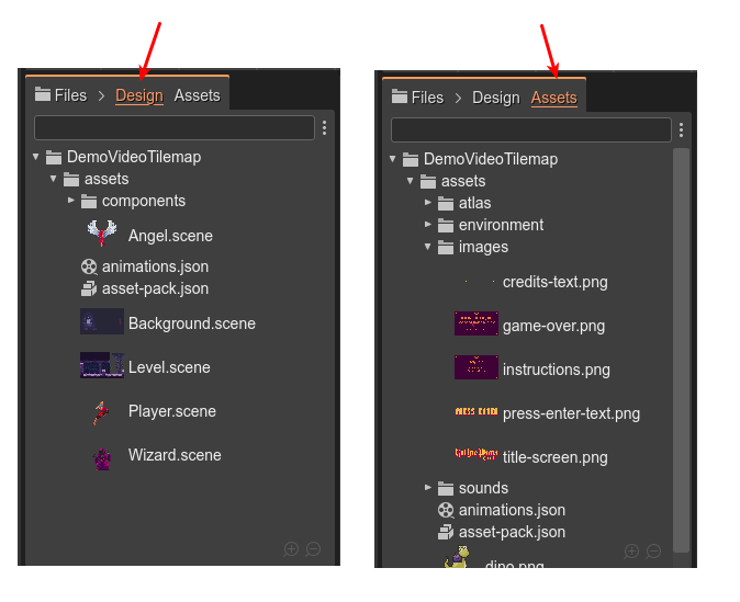
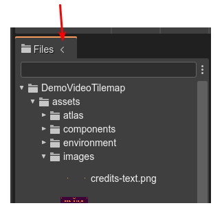
By default, no tab is selected and all files are shown. Even, you can collapse the “tabs sections”.
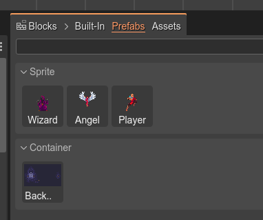
Grouping prefabs by type
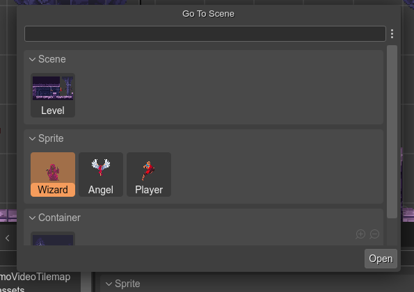
In the previous release, the editor included a way to group the items in the Blocks view and some dialogs. In this version, when you select grouping the items by type, the prefab files are grouped by the Phaser type they implement: Image, Sprite, Container, etc…
This also applies to the Go To Scene dialog (Ctrl+Alt+O):
Monochromatic icons
Yes, I replaced the old Blender icons for… the new Blender icons! Just take a second view of the previous images. I hope you like it. In the future, I should implement a way to install different icon themes.
Viewer cell rendering layout improvements
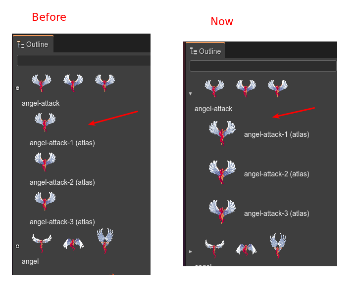
I improved the layout of cells when you zoom a viewer. Before, the editor used a vertical layout, showing the “image” above the “label”. Now this layout is used only in few cases, like the animations in the Outline of the Animations Editor. So, by default, the images are rendered at the left of the label:
Viewer cell rendering of BitmapFont assets
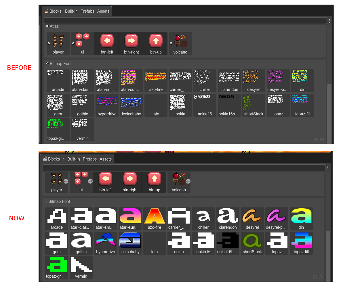
Now the BitmapFont assets are rendered in viewers using only a single character (not using the whole bitmap):
What’s next?
This was an “emergency release”, so the plans remain the same since the previous release:
…work on the GitHub issues reported by you, like providing better support for JavaScript modules and 9-slice scaling.
Keep in contact!
Arian